Dashboard Builder
Find it: Reports → AI Dashboard Builder in the sidebar (and the Dashboards list).
Sound familiar?
- "I need a chart for the Monday meeting — can someone pull the numbers?"
- "Every site wants a slightly different view."
- "Our static reports never answer the actual question."
Static reports answer yesterday's question. A dashboard answers today's.
The Problem
Off-the-shelf reports are somebody else's questions. When you need a specific cut — downtime by line this week, PM compliance by technician — you wait on someone to build it. By the time you get it, the moment has passed.
What OpexMX Dashboard Builder Does
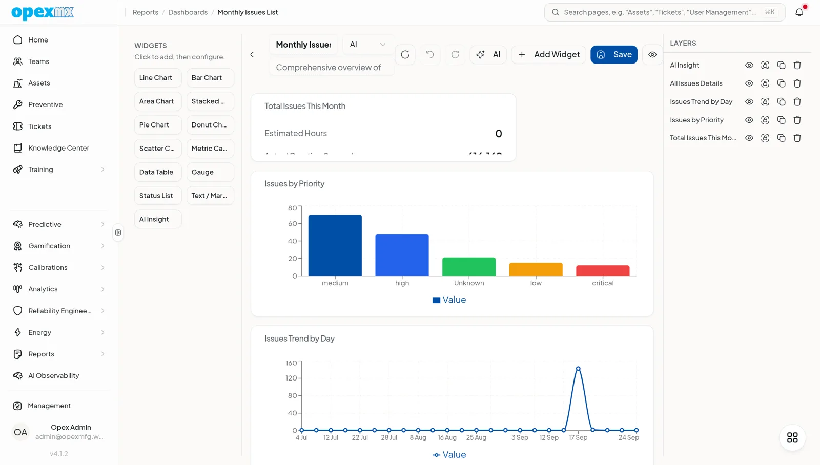
Lets you compose your own dashboards from live maintenance data — widget by widget — or describe what you want in plain language and let AI assemble a first draft.
Widget Types
Line, bar, area, stacked-bar, pie, donut, scatter, metric, table, gauge, text, and an AI-insight widget that writes the takeaway for you.
Real Data Sources
Widgets bind to real endpoints — work orders, assets, inventory, downtime, MTBF/MTTR, personnel and PM performance, parts stock, energy consumption, carbon footprint, and sustainability. Data is fetched in-process through the API adapter (no raw SQL, no credentials leaked to the model).
AI, Three Ways
- Generate — describe the dashboard in plain language (optionally attach a photo of a chart or SOP); AI returns a validated plan of up to six widgets. It can only use fields that exist, so no invented metrics.
- Co-edit — an iterative editor: ask for changes in natural language and the agent adds, updates, or removes widgets, streaming each edit live.
- Insight — point it at a widget and get a three-sentence narrative: what and where (with numbers), who and when, and one corrective action.
Layout
Drag widgets onto a grid (column/row/span), reorder, and save. Default dashboards ship out of the box.
How It Works
- Pick a data source for a widget (or let AI choose).
- Configure grouping, aggregation (
count/sum/avg/min/max), field, time bucket, and filters. - Choose a chart type and place it on the grid.
- Ask the AI to generate, co-edit, or explain — at any step.
- Save the dashboard; share the view with your team.
Who Uses This?
| Role | What They Care About |
|---|---|
| Managers | The exact cut they need, without waiting |
| Reliability Engineers | MTBF/MTTR and downtime by asset, fast |
| Planners | PM performance and backlog at a glance |
| Operations | Energy, carbon, and sustainability trends |
Pro Tips
- Start from an AI-generated draft, then refine — faster than a blank canvas.
- Use the AI-insight widget on your noisiest chart; it surfaces the takeaway.
- One dashboard per audience; resist the mega-dashboard.
- Time-bucket long ranges so trends stay readable.
Integrations
- Analytics: widgets pull from the same analytics endpoints (MTBF/MTTR, bad actors, parts stock)
- Reports: dashboards double as report sources
- Energy / Carbon: dedicated data sources for sustainability views